1 / 5
Enrique Encabo, Inmaculada Esteban Maluenda, Íñigo Cobeta
Architecture is, according to Renato de Fusco, a logotechnics, «a system composed of functions and signs that, in addition to fulfilling a specific purpose, also serves as a means of communication between social groups».1 Enunciated more than fifty years ago at the height of the semiotic craze, today these words can be reinterpreted through the metamorphosis of the architectural work from content support to content in its own right. Thus, architecture conceived as a medium for communication systems, from Robert Venturi and Denise Scott Brown's decorated shed to multimedia screens, has modified its presence or simply been replaced by its own virtual image. This article seeks to analyse this hypothetical transition, using the example of OMA, Rem Koolhaas' office, showing how his initial interest in the actual medium of his buildings very gradually shifted towards a specific control of this communication and its formats.2
To this end, the study period chosen examines the works executed between 1989, a critical year, and the final major publication carried out by the studio itself: the Domus d'autore, «Post-Occupancy», guest edited by Koolhaas. The two decades since its publication in April 2006 help provide an understanding of the use of digital resources, from video photographs to internet image banks, seemingly casting aside any mediation over public self-presentation, a topic with which Koolhaas, as a former journalist, was obsessed. One obvious precedent is Delirious New York (1978). His fascination with postcards and memorabilia, as well as with the drawings by Madelon Vriesendorp, serves to disseminate a popular and unconventional image of architecture. This trajectory can therefore be structured as a series of clearly delineated stages: an initial stage linked to the work of 1989 and the publication in 1992 of a specific project, Villa dall'Ava; an intermediate one providing an account of the consequences of the 1995 release of S, M, L, XL, which would derive in Content, a decade later; and a final phase in which Koolhaas, frustrated by the burden of his public image, decided to shun his starchitect status and conventional photographic resources for this special issue of Domus. In the «Preface», as in other works such as «The Generic City», Koolhaas omits references to the authorship, intentions and means of production: «With this issue we try to (re)present four recent buildings in a fresh, more complex way. We don't insist on the buildings' qualities, but monitor their effects on their respective hosts and users. There are no 'critics' —usually, best friends in drag— no intimidation» (Koolhaas 2006, unpaged). This disappearance of the figure of the critic ought to be seen as a final step in the progressive absorption of content and channels, one which had begun to take shape almost two decades earlier, in the summer of 1989.
1989 was a decisive year for OMA. While overseeing the works of the Kunsthal, Fukuoka, Euralille and Villa dall'Ava, in the summer they took part in the competitions of the Zeebrugge Sea Terminal, the Bibliothéque de France (or the Trés Grande Bibliothéque, TGB) in Paris and the Zentrum für Kunst und Medientechnologie in Karlsruhe (ZKM). These three projects were essential to the studio which, based on the culture of congestion of Delirious New York — the independence of the different layers of functions and the separation of external image and content (Lootsma and Van Stralen 1990) — eventually brought about the «Bigness» manifesto of S, M, L, XL.3
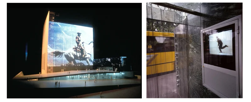
In the last of these projects, the ZKM, the façade was transformed into an immense video screen display projected towards the urban space, with the indispensable collaboration of Hans Werlemann. With a background in commercial photography, Werlemann was a member of the Utopia art collective who began a working collaboration with OMA around 1982.4 Along with his partner Claudi Cornaz,5 he devised a laser projection system for Karlsruhe, which made it possible to create images matching the size of the façade, an ingenious technical solution which was studied to be later used in real life situations (Hall 2022). This animated billboard directly alluded to the public mediatic space, but around 1992 the cancellation of the project put paid to any hopes of this becoming a reality. The idea ultimately took the form of the far more modest execution of the Video Bus Stop in Groningen, also proposed in 1989, but completed in 1991. This represents a dependency on the video image as a means of expression of the building which, from then on, was gradually removed from the work of OMA.6
In parallel with this fleeting preference for screens, OMA also showed an interest in communication regarding the projects mentioned earlier. The company even generated its own material which was independent from the architectural process. For the TGB in Paris, following the loss of the competition, new models were created and the competition's linear perspectives replaced with a series of computer-generated images.7 In the case of Villa dall'Ava, as this was an already existing building, OMA devised an exceptional communication campaign with a painstaking control of the narrative. To do so, Werlemann developed a series of scenarios and happenings which ideally should have generated different sets of images for the different publications (Bart Lootsma 1993). This attempt at control was executed with the complicity of certain media. However, this was not the case with all of them, as can be gleaned from the trajectory of the publications related to the project.
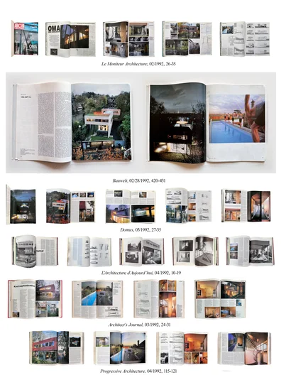
From February 1992, publications began, with an initial appearance in Le Moniteur Architecture with a text by Jacques Lucan (later republished in Domus), as the client in the house was an executive working in this publishing group. Also dating from February, we find a feature in Bauwelt, with a text by Bart Lootsma.8 In both, the descriptive photographs of the building — shown on a small scale in the French magazine and occupying a full page in the German one — were combined with Werlemann's visual planning, in which a giraffe, on loan from a circus, wandered through the garden.9 The project was completed with a series of swimmers on the cover (Bauwelt), evoking the history of the swimming pool of Delirious New York, together with ideas such as that of a panther in the bedroom, which was never completed, and a nude in the shower which the owners did not authorize initially (Lootsma 1992).
This nude appeared in Domus (behind a translucent screen) the following month (p. 33).10 In this case, the images chosen were mostly taken at night. Once again, shots from Werlemann's visuals appeared, with new photographs of the swimmers. In April, L'Architecture d'Aujourd'hui (pp. 10-19) used general descriptive images, avoiding, when possible, the repetition of previously published material, as seen in the photograph of the swimming pool, which differed only slightly from that featured on page 34 of Le Moniteur.
However, the English-language media shunned almost all Werlemann's material, instead choosing a feature shot by Peter Aaron, a student of Ezra Stoller's, as can be seen in Architect's Journal (March 1992, pp. 24-31), the US publication Progressive Architecture (April 1992, pp. 115-121; with text by Jean-Louis Cohen), and House & Garden (March 1992, pp. 158-165).11 Aaron's nod to OMA in his feature included a night-time photograph with a female swimmer in a somewhat unlikely poise, about to dive perpendicularly to the long side of the pool.
Monograph publications, including GA houses (issue 36) and El Croquis (issue 53, March 1992), did not use the surrealist iconography supplied by OMA. They worked with their own photographers, Yukio Futagawa and Hisao Suzuki, respectively. Fernando Márquez, editor of El Croquis, remembers Koolhaas' presence in the session. Although his interventions were minimal, he insisted that the order of the feature should follow a structured sequence, following the route from start to finish, thus generating a pregnant structure, somewhat inherited from Koolhaas' past as a film scriptwriter.12
In fact, as emerged almost thirty years later, the origin of the images was indeed cinematographic. In 2020, Werlemann and Cornaz presented the documentary on the house, 2042: The Villa Dall'Ava (SToA) for the first time. Filmed in 1992, the photographer offered the following explanation for the film's delayed release: «The film was not presented because we never took the opportunity in it. The problem is, I recognize now, that the story about the giraffe got more important than the Villa».13
Despite the discarding of the movie, other visual projects by Cornaz and Werlemann kept leaving a permanent imprint in the studio's public image. Around 1985, Werlemann and Cornaz began to produce blurred photographs taken from television screens, a technique which set OMA apart from the conventional means of representation, as was soon noted by some critics (Stein 1992).14
The origins of this technique can be traced back to the cover of issue 238 of L'Architecture d'Aujourd'hui in 1985. Werlemann has always been adamant about the identity of this unique method to reflect the architecture of OMA: «There are films that have a very fine grain. I never use them. […] I sometimes take pictures on 8mm film. I can get a sort of a "dream effect" or "like a memory" — an effect of blurriness, like the one with the television screen (very low in pixels)» (Schurk 2022, 427). The influence of video images on the materials of S, M, L, XL is undeniable, as can be seen in the pages devoted to the installation of the Milan Triennial (pp. 54-55, 60-61), the Netherlands Dance Theater (pp. 308-309, 311), the ZKM (pp. 742-743, 744-745, 749, 756-757), and the illustrations of «The Generic City» (pp. 1238-1247) which could be seamlessly linked to the advertising textures of the time.
It is clearly not possible to expound here on the content and consequences of a book of such importance and relevance. However, it is possible to appreciate the critical effects of this predilection for new visual textures. Koolhaas considered S, M, L, XL to be a response to the tribulations of 1989 and certain failed expectations regarding the professional stability and status of OMA in the early 1990s (Zaera 1996, pp. 10-11), although heterogeneous multimedia images and the mix of graphic elements and words led to a considerable degree of confusion.15 Perhaps spurred on by the author, in 1996 both Terence Riley and Jeffrey Kipnis, partners in crime mentioned in the Acknowledgements of the book (xxix) wrote articles in L'Architecture d'Aujourd'hui and El Croquis. Part of the debate focused on the format: while Riley considered the book to be a reinvention of the media presence of architecture, Kipnis — who ironically referred to 'critical ineptitude' (Kipnis 199, p. 26)16 — explicitly defended the use of video tools as the only way to reflect human presence in architecture. It should be noted that the features of S, M, L, XL, such as that on the Kunsthal (by Werlemann) or Euralille (designed by Mark Schendel/OMA) provided a no-holds-barred depiction of this human presence.17
After the publication of S, M, L, XL, AMO, the office's new think tank, was founded as an independent division of OMA.18 Media presence was starting to be seen as an independent parallel discourse which brought about the emancipation of part of the office, which chose to distance itself from the tedious daily practice of architecture for producing a different type of spatial representations and broadening the professional spectrum. In fact, it was this tension between OMA and AMO which largely brought about the publication of Content.19
In contrast with the titanic effort to create new characteristic graphic languages from the perspective of the practice of architecture in S, M, L, XL, Content was closer to an intentionally popular mass communication (Big Brother, internet sales and video games) and resorted to an iconoclastic caricature to expose the instability of OMA, both in terms of professional practice, and from a global perspective. Neither a book nor a journal, published in a gossip magazine format, Content seemed to consolidate the idea that physical presence, which had been so important years earlier, was turning towards different ways of self-presentation, as Koolhaas had made clear in his 1999 conversation with Sarah Whiting on the pages of Assemblage:
For Prada and Seattle, we are working, for the first time, also on the electronic presence and architecture, which is visually interpreted as an entirely separate identity. Here we aim for mutual reinforcement. […] What is different from 1989 is that we are now also thinking of the building and its existence in virtual space, where it will be the emblem of the library headquarters. We're looking for a gestalt that is effective in actual and virtual space. (p. 50)
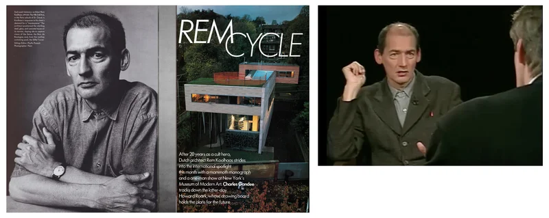
In this final stage an experimental approach was taken to this orientation of the virtual presence of the building. In April 2006, Rem Koolhaas took over, together with AMO, the first (and to date, only) issue of Domus d´autore: «Post-Occupancy». Along with earlier efforts to present his work to the public through a painstaking exercise in iconoclasm (Colomina 2007, p. 368), Koolhaas was increasingly sceptical of the sway of his own public status. Paradoxically, his efforts to dismantle and dispel the myth of the work of the architect (Zaera 1996, p. 25) had in effect made him iconic, with appearances on the Charlie Rose Programme (1994 and 1996), in Vogue20 and the New York Times (Luscombe, 1996), emphasizing for instance the Maserati he used for his visits to the Lille work sites as a juicy detail for characterization.21
As stated above, the interest in media overexposure had already been a feature for Koolhaas from the initial stages of OMA (Zaera 1992, p. 7),22 and towards 2005 the architect specifically reflected on the issue in Perspecta (p. 103):
Q: So do you view yourself as a celebrity?
A: I see a very important distinction between fame, which I feel is related to work, and celebrity, which is related to the person. […] I would say that in the case of the Whitney Museum project, for instance, the reasons why we were chosen were probably more related to celebrity than to the work itself. And that also made it easier for them to reject the project ultimately, because they could spin it and use the preexisting typology of the celebrity — a person who won't listen, who refuses to compromise. So that was a very negative experience of celebrity culture.23
With this background, it is not far-fetched to see his «Preface» to the Domus d'autore as an attempt to counter this constant media presence:
[The starchitect is] a contemporary Faustus: drowning in attention, but not taken seriously. But Faust, at least, could make his own deals: his present, reduced embodiment is the creation of a thousand marketing strategies, borderline magazines, frantic part-timers, promiscuous freelancers, risk-averse political calculations, ultra-compressed TV spots, […] A combined process of corrosive adulation mercilessly registers such crucial details as hairstyles, labels, love lives, glasses, shoes, and other marks of architectural genius. (Koolhaas 2006; unpaged)
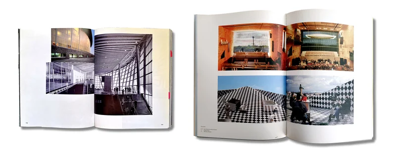
Compared to Content, Domus now constituted a veritable exercise in containment. Using a seemingly objective and balanced structure, four buildings were presented: the embassy of the Netherlands in Berlin, 1997-2003; Seattle Central Library, 1999-2004; the McCormick centre at Chicago IIT, 1997-2003; and the Casa da Musica in Porto, 1999-2005.24
The presentation was systematic, with no graphic distinction between projects. Each was presented in a booklet with no page numbers, divided into 7 sections: aerial photography; news cuttings from the day, including the inauguration of each building; «Context», with images of the surroundings; «Users», with different ways of presenting the user experience, from the feature to the comparison of model/reality (Porto); «Visual Language», or meticulous photographs accompanied by a critical text; «CAD-Scan», an overlay of the CAD plans of the project and at the end, diagrams mentioning all types of data.25 These booklets had interspersed leaflets showing different types of information, collecting all 4 buildings and representing the traditional media, public, critics, and finally, Big Brother, with juxtaposed security camera shots appearing on the openings.26
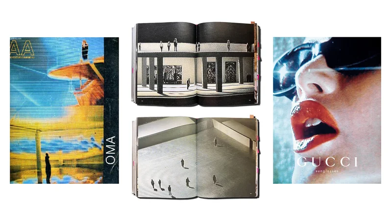
However, this proposal was less innovative than intended. Some of the substantial features of this «fresh, more complex way» championed by Koolhaas in his presentation can be identified in his earlier works. In terms of form, the video texture, found in the CCTV stills or news items, as a popularization of Werlemann's visual essays, has already been highlighted. Other resources such as the parallels between the model and the built work in Porto, had been tested at the presentation of the Lille Congrexpo in S, M, L, XL. Equally, the photographic sections of the Chicago building were reminiscent of Ed Ruscha, who had been featured when Koolhaas and Obrist had interviewed Venturi and Scott Brown for Content (Koolhaas, Obrist 2004, p. 154).
As regards concept, the project cannot be considered as innovative as originally thought. Koolhaas concluded his presentation by stating: «We looked through the eyes of tourists and artists, trusted others to record. Away from the triumphalist or miserabilist glare of media, we wanted to see what happens in the absence of the author, to represent the realities we were complicit in creating, post-occupancy as facts, not feats».
In actual fact, this abandonment of representation in the hands of the user is rather reminiscent of the rhetoric seen in «The Generic City», the final text to appear in S, M, L, XL. The circle is closed: «What are the disadvantages of identity, and conversely, what are the advantages of blankness? What if this seemingly accidental — and usually regretted — homogenization were an intentional process, a conscious movement away from difference toward similarity? […] What is left after identity is stripped? The Generic?» (Koolhaas 1995, p. 1248).
According to this approach, the built project became the trial run for itself, legitimized by a community removed from the critics which was in charge of making it into a consumer project for mass communication. Just as in «Bigness» or «The Generic City» Koolhaas had spoken of operations escaping all control, in «Post-Occupancy» his editorial approach takes the form of an apparent sublimation of the inevitable (Zaera 1996, p. 23), the assumption of an overwhelming ever expanding new virtual space where trying to forge an identity and to control reproductions no longer makes sense on such a global scale.
The virtual presence of architecture, an essential part of the OMA project, was conspicuous in the pages of Domus, and was a constant reminder of his prophecies for the future of the city, «The Generic City is what is left after large sections of urban life crossed over to cyberspace» (Koolhaas 1995, p. 1250). This could also be said of the medium, which had finally been transformed from a complement to the substitute of tangible architecture.
This article presents some results from the research project: Conexiones de la arquitectura española con las Américas: academia, profesión y difusión (1976-2006). RETRANSLATES02. (I.P.1: Ana Esteban Maluenda; I.P.2: Marta García Carbonero; Ref.: PID2022-138760NB-C22).
1 De Fusco refers to the term coined by Roland Barthes. ↩
2 Both the book Project without Form — OMA, Rem Koolhaas and the Laboratory of 1989 by Holger Schurk and the publication by Christophe van Gerrewey, OMA / Rem Koolhaas, a critical reader, have been essential to the work developed in these pages. ↩
3 And, a few years after this, it led to the ironical copyrighting of universal modernization of Content. Both Zeebrugge and ZKM could be considered approximations to the duck and the decorated shed by Venturi and Scott Brown. ↩
4 After parting ways with Elia Zenghelis in 1987, Koolhaas understood the need to intensify collaborations (Zaera 1992, p. 9). The physical proximity of the OMA headquarters, in Boompjes at that point, and that of the Utopia collective, a water tower on the north bank of the river Meuse, facilitated intense collaboration. In order to date the collaborations of Werlemann, see credits in S, M, L, XL, p. 1272. The first project in which Werlemann is credited is Parc de la Villette. In his conversation with Holger Schurk (p. 426), he acknowledges that as the first project he worked in. Alongside Petra Blaisse, Werlemann took charge of one of the first retrospective exhibitions of the office, OMA — The First Decade (Museum Boijmans Van Beuningen, 1989) which he personally considered a direct antecedent of S, M, L, XL: «The book would be the exhibition. That was the idea. But that was not the idea of Rem […] Later, he said: 'Let's make the book'» (Schurk 2022, p. 428). ↩
5 Also a member of the Utopia group. ↩
6 Werlemann does not appear as a collaborator in this project or in that directly preceding it: the reinterpretation of the Barcelona Pavilion by Mies van der Rohe for the 1986 Milan Triennial. In keeping with this, a possible link, albeit with a looser connection, was the 1991 project for the Zac Danton Tower in la Défense, with a horizontal billboard-floor emitting situationist messages. ↩
7 According to Holger Schurk (p. 249), OMA created the famous models of voids and fillings in the library two years after the competition, in 1991. These materials replaced the more conventional linear perspectives of the third competition panel. Koolhaas had decided not to use them in the final presentation, but from that point on they replaced clear linear drawings. These computer-generated images were published as early as in Six Projets, the publication by the Institut Français d'Architecture on OMA, from 1990. In the case of computer-generated images, Art Zaaijer, in charge of the TBG project, stated (Schurk, p. 417): «The Glossiness of the renderings was totally new to us. It didn't have anything of the typical OMA-like, rough, impulsive, clear quality. The glossiness was new to us because we were not gloss at all». ↩
8 The Bauwelt feature was used again in L'architettura, cronache e storia (July-August 1992), 529-532. ↩
9 The significance of the giraffe is open to multiple interpretations. One of these, as recounted by Werlemann in SToA talks in Stuttgart (2020) suggests that it was a reference to Koolhaas' father, who had written some stories on animals. ↩
10 The idea eventually resurfaced, albeit in a different project: the first image of the Dutch house in S, M, L, XL (pp. 64-65) is a double spread picture of a female nude blurred behind a glass, taking a shower, which is also the last image in El Croquis 53 (p. 61). ↩
11 In Architect's Journal (p. 31) however, some of the few views of the main room of the house can be seen together with the detail of the curious peephole which allows onlookers to see into the pool. ↩
12 El Croquis incorporates a side photograph (p. 137) taken from the north side of the lot (the garage side) appearing in no other publication. In conversation with the authors, the editor, Fernando Márquez, recalls how the image was taken surreptitiously before the neighbours, with whom the homeowners were at odds, were alerted. ↩
13 Werlemann's words are heard around minute 58:45. The host, Stephan Trüby, mentions that Bart Lootsma wrote at the time that Rem Koolhaas had decided not to use that film. ↩
14 «As might be expected, the group has taken its experiment with technology one step beyond simply using the computer as an electronic pencil. For example, video cameras film rough study models, from which still shots are printed. The images, blurred and purposefully vague […] For in the end, OMA's art raises the thorny question of what a drawing means: is it an actual tool of design, or merely an edited representation of it?» It should be remembered that the Creative director in I.D. was none other than Bruce Mau. ↩
15 «It emerges as a kind of multimedia experiment trapped on too much paper, a rambling hypertext without a navigational device» (Novosedlik 1995). See also Brittain-Caitlin in The Architectural Review: «Not avoiding contradictions means resigning from the intellectual discipline which could have given so large a book great value. And this is an unnecessary problem: 50 pages of Hans Werlemann's photographs for each project, however small, could have resulted in a visual tour de force, […] but words spew everywhere. There are just too many of them […] The result is dangerous, visually, to the real subject». ↩
16 He jokingly included himself amongst the critics who could not grasp Koolhaas' architecture at first sight. ↩
17 Riley: «S, M, L, XL is not so much a book itself but a space in which the media creations of architecture — the book, the photograph, the film — collide, mutate and reinvent themselves». See also Kipnis: «An excursion through a century of published architectural photography finds an overwhelming preference for empty buildings. The canonic drawings of architectural design and representation — plan, section, elevation, axonometric and perspective — all are denuded of activity. In fact, there is no canonic representation of activity in the building other than the adjacency and circulation diagrams; none whatsoever exists for the more complex issue of event-structure. The only class of drawing that attempts to undertake such a representation is a collage, a prevalent but far from canonic technique. And is it an accident that the media best suited to represent activity, such as film and video, still have found no intrinsic role in architectural design technique or criticism?» (p. 36). ↩
18 Although a precedent could be seen in the form of the Groszstadt Foundation, which promoted OMA research, publications and exhibitions, and was conceived following the preparation of S, M, L, XL and the exhibition organized by MoMA on the studio in November 1994, the foundation of AMO was formalized in 1995 (Archis 20. #1, p. 25). ↩
19 From the «Preface» by Rem Koolhaas: «Content documents a 'split' — a grand écart, the fiendishly difficult moment, immobile, on the ground in a classical ballet — the maximum stretch between two opposite forces, realization and speculation, performed by OMA and AMO». ↩
20 The cause of such presence was the opening of the exhibition Thresholds/OMA in the Museum of Modern Art, November 1994, and of course, the edition of S, M, L, XL. Two different versions of the book can be seen in the Charlie Rose interviews. ↩
21 In the interview with Charlie Rose (5:20), Koolhaas mentions the importance of screenwriting «in terms of the inner workings of the profession». ↩
22 «In the end, it was also the final installment of my transformation from a writer into a building architect, that began in the early 80s, I simply had to learn a vast part of the profession. It was ridiculous being already "known" in the middle of such a process, happening all in the public eye». ↩
23 See also AA Supercritical (Steele 2006, p. 35): «Audience member: …why you both try to deny the very spectacle that you inadvertently do so much to create? PE: You better ask Rem first. [Laughter] RK: I think neither of us is trying to deny this media condition. But it is obvious that this is an incredibly difficult situation, because there is a conflict between the extent to which it is imposed on you by expectation, and politically. […]». ↩
24 These had been compiled in Content as a wider sample which organized the projects from west to east, from the LACMA in Los Angeles to CCTV in Beijing. ↩
25 According to this section, the Berlin embassy cost the same as 300 kg of cocaine or 1 ton of caviar. ↩
26 These booklets contained: 1) Images from news programs; 2) Comments from the public on forums, seemingly unfiltered; 3) A vast corpus of critical commentary culminating in a succinct reconstruction of the profile of each individual project; 4) Security camera images from the individual buildings. ↩
ARCH+ features SToA – Vol. 8: Expanded Photography – The Work of Hans Werlemann. [online] Available at: facebook.com/archplus [last access 01 June 2025]
Archis+AMO+C-lab+… (ed.; 2005) – "Architecture must go beyond itself plus AMO History of Europe and the European Union", Archis vol. 20 #1.
Brittain-Caitlin, T. (1996) – "Killing the edifice". The Architectural Review, June, 96.
Colomina, B. (2007) – "The Architecture of Publication: Rem Koolhaas in conversation with Beatriz Colomina". El Croquis 134-135, 348-377.
De Kooning, M. (1985) – "The economics of imagination". Vlees & Beton 4, unpaged. Reproduced in Van Gerrewey, 111-118.
De Fusco, R. (1970) – Arquitectura como «mass medium». Anagrama, Barcelona. Translation by Francisco Serra Cantarell. Originally published as Architettura come mass medium, Bari, Dedalo, 1970.
Gandee, C. (1994) – "Rem Cycle". Vogue, November, 330-335.
Goulet, P. (1990) – O.M.A / Rem Koolhaas: Six Projets. Institut Français d'Architecture, Paris.
Hall, R. (2022) – "Drawing Matter". OMA CONVERSATIONS. OMA: Collaborators—Allies [online] Available at: drawingmatter.org [last access 03 June 2025]
Kipnis, J. (1996) – "Recent Koolhaas". El Croquis 79, 26-37.
Koolhaas, R. and Mau, B. (1995) – S, M, L, XL. The Monacelli Press, New York.
Koolhaas, R. and AMO/OMA (2004) – Content. Taschen, Cologne.
Koolhaas, R. (2005) – "A conversation in the Carlyle Hotel". Perspecta, vol. 37, 98-105.
Koolhaas, R. and AMO (2006) – "Post-Occupancy". Domus d'autore, 1 (April).
Lootsma, B. (1992) – "Oma Manifesto". De Architect 3.
Lootsma, B. (1993) – "Hans Werlemann". De Architectthema 5, 22-23. Reproduced in Van Gerrewey, 202-203.
Lootsma, B. and Van Stralen, M. (1990) – "The Client as Visionary: Koolhaas reanimates the role of the architect". Archis 5, 36-42. Reproduced in Van Gerrewey, 176-180.
Lucan, J. (1990) – OMA - Rem Koolhaas: Architecture 1970-1990. Electa, Milan.
Márquez, F. and Levene, R. (ed.; 1992) – "OMA / Rem Koolhaas 1987-1992". El Croquis, 53.
Márquez, F. and Levene, R. (ed.; 1996) – "Rem Koolhaas / OMA 1992-1996". El Croquis, 79.
Novosedlik, W. (1996), 90-95.
Riley, T. (1995) – "Chute libre". L'Architecture d'Aujourd'hui 304, 58.
Rose, C. (2016) – Charlie Rose. Rem Koolhaas. Thursday 01/14/2016 [online] Available at: charlierose.com [last access 03 June 2025]
Schurk, H. (2022) – Project without form: OMA, Rem Koolhaas and the laboratory of 1989. Spector Books, Leipzig.
Steele, B. (ed.; 2006) – Supercritical: Peter Eisenman & Rem Koolhaas. Architectural Association, London.
Stein, K. (1992) – "The image according to O.M.A.". ID 1, 66-75. Reproduced in Van Gerrewey, 201-202.
Van Gerrewey, C. (ed.; 2019) – OMA/Rem Koolhaas: a critical reader. Birkhauser, Basel.
Whiting, S. (1999) – "A conversation between Rem Koolhaas and Sarah Whiting". Assemblage 40, 36-55.
Zaera Polo, A. (1992) – "Finding freedoms: conversations with Rem Koolhaas". El Croquis 53, 6-31.
Zaera Polo, A. (1996) – "The day after: a conversation with Rem Koolhaas". El Croquis 79, 8-25.
Fig. 1 – Decorated sheds and screens. Left: Zentrum fur Kunst und Medientechnologie, Karlsruhe. Competition Model, 1989. © OMA / Hans Werlemann. Right: Groningen Video Bus Stop, 1991. © OMA.
Fig. 2 – The reviews of Villa dall'Ava in order of appearance, from Le Moniteur (Feb. 1992) to Progressive Architecture (Apr. 1992). In English/American Magazines, Werlemann images were almost fully discarded. Image by the authors.
Fig. 3 – Video textures. Left: L'Architecture d'Aujourd'hui 238. Cover photo by Hans Werlemann. / Center: ZKM video images by Hans Werlemann in SMXL, 1995. / Right: Gucci advertisement by Mario Testino, 1997-1998.
Fig. 4 – «Do you view yourself as a celebrity?». Left: Koolhaas in Vogue, November 1994. Right: With Charlie Rose, 1994.
Fig. 5 – From model to building, presented in the same view. Left: S, M, L, XL, 1995. / Right: The same resource in Domus, 2006.